
Booking and the first appointment
Put booking in the header of every page and make it the first thing a thumb can reach. A dental search usually ends in one of two ways: an appointment taken online in the next minute, or a phone call that goes unanswered because it is Sunday.
Online booking should show real free times, let the patient pick the reason for the visit, and confirm by email and text. If your calendar cannot be opened to the public, at least show the next available date and a callback request form.
We build these as online booking and scheduling tied to the clinic's own calendar, so the site never offers a slot that no longer exists.
Prices and Kela reimbursement
Publish a price list for your common treatments. Examination, hygienist visit, a filling, a root canal, a crown. Patients compare dental prices harder than almost any other service, and a clinic with no prices is assumed to be the expensive one.
On Kela, stick to what Kela says. Checked on kela.fi on 20 September 2026: reimbursement is available for oral and dental care given by a dentist or specialist dentist, and for laboratory tests and x-rays that they prescribe. Cosmetic treatment such as tooth whitening is not reimbursed, and neither are office or administrative charges. Patients can also have up to two oral hygienist appointments a year reimbursed without a referral from a dentist. In most cases the reimbursement is granted at the place of care when the patient shows the Kela card, and otherwise it is claimed from Kela afterwards.
Explain the mechanism on your site and leave the amounts to Kela. The reimbursement is a fixed sum per treatment set by Kela, and those sums change. Say which of your treatments carry a reimbursement, say that you handle it at the desk, and link patients to kela.fi for the current figure. A wrong number about money costs more trust than a missing one.
Fear, tone and photos
A large share of your visitors are people who have avoided a dentist for years and are ashamed of it. Write to them directly. A short page saying that you see this every week, that nobody will comment on the state of their teeth, and that a first visit can be nothing more than a look, brings in patients no advertisement reaches.
The tone across the whole site follows from that. Calm sentences, no exclamation marks, no promises of a perfect smile.
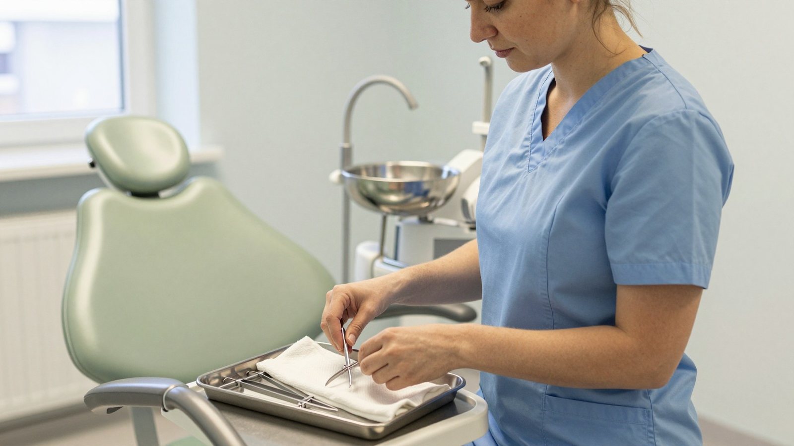
Photographs matter here more than in most trades. Show the waiting room, the corridor, the actual treatment room and the people who work in it. Stock close-ups of white teeth make an anxious person feel worse.
Local search and reviews
Most dental searches are local and most of them end in the map results, so your Google Business Profile does as much work as your website. Opening hours, the correct address, photographs and answered reviews are the job.
Ask satisfied patients for reviews as a routine at the desk, and answer every one, including the bad ones, without ever confirming that the person was a patient. Health data has no exceptions for review platforms.
On the site, make sure the address is in plain text, the hours are current including holiday weeks, and the town appears in your page titles. Our guide to local SEO for a business in Helsinki applies to any Finnish town.
What the best website for a dentist in Finland gets right
It answers the four practical questions fast: can I get an appointment soon, what will it cost, will this hurt, and how do I get there. Everything else on the site is secondary.
The clinics that do this well have a booking button that is always visible, a price list they are not embarrassed by, a treatment page per procedure written in patient language, and photographs of the real place.
They also keep it current. Nothing damages a clinic faster than a site advertising a dentist who left last spring.
One page per treatment people search for
Patients search for the thing that hurts or the thing they have been told they need. Implants, wisdom tooth removal, root canal, veneers, whitening, braces for adults, hygienist visit.
Each deserves a page that says what happens during the appointment, how long it takes, how many visits, what the recovery feels like and what it costs at your clinic. Write it as you would explain it in the chair.
These pages carry the search traffic and they also shorten the appointment, because the patient arrives having already understood the options.
The emergency patient at nine in the evening
Acute pain drives a large part of your search traffic, and those searches happen outside office hours. Have a page for it, findable in one tap from the front page.
Say what to do tonight, when you open, whether you keep slots for acute cases, and where to go if the pain cannot wait until morning. Pointing a patient to the public emergency service at midnight does not lose you the patient, it wins their trust for the follow-up.
Make the phone number on that page tappable and put the address right beside it. Nobody in pain is going to search your contact page.
New patient information, written once
What to bring, how early to arrive, where to park, what happens if they are late, how cancellation works and what your fee for a missed appointment is. Put it on one page and link it from the booking confirmation.
This page saves the reception more time than any other part of the site, and it prevents the argument at the desk about a cancellation charge nobody knew existed.
Keep the tone practical. This is the one page where a plain list beats prose.
A dental enquiry is health data
The moment somebody writes about a broken tooth in your contact form, you are handling health data. That means an encrypted connection, messages delivered somewhere access-controlled, and a clear retention rule.
Do not ask for symptoms, medical history or a personal identity code in a public form. Collect a name, a contact detail and a reason for the visit, then move the rest into the booking system or a phone call.
Say plainly next to the form what happens to the message. The cookie and consent side is covered in GDPR and cookies on a Finnish website.
The team page does more work than you think
Patients choose a dentist, not a clinic. Give every dentist and hygienist a photograph, their languages, what they focus on and how long they have worked with you.
Nervous patients read these pages closely, looking for somebody who sounds gentle. A line about how a dentist works with anxious patients or with children converts better than a list of courses.
Use the same photographer and the same light for everyone. A team that looks like it was assembled from different websites feels temporary.
Languages your patients actually need
In the capital region, in university towns and anywhere with international employers, a share of your patients live their lives in English. Dental vocabulary is exactly the vocabulary nobody learns in a new language.
Publish the treatment pages, the price list and the booking flow in English, and say which of your staff speak it. Swedish matters on the west coast for the same reason.
Translate the parts that carry decisions rather than the parts that carry atmosphere. An English front page followed by a Finnish price list helps nobody.
Booking systems and the no-show problem
Automatic reminders by text and email pay for themselves in this trade. A missed appointment is an hour of a dentist's time that cannot be resold, and a reminder the day before removes most of them.
Choose a system that lets patients move or cancel their own appointment. Every self-service cancellation is a slot you can refill and a phone call reception did not have to take.
We compare the options in booking systems for a salon or clinic in Finland.
Accessibility, older patients and big text
A meaningful share of dental patients are over seventy. Small grey text on a white background is the single most common way a clinic site fails them.
Strong contrast, a base text size that does not need pinching, real buttons rather than thin links, and a booking flow that works with a keyboard. None of it costs anything at build time and all of it is expensive to retrofit.
Test the site once with your phone's text size set to large. What breaks is usually the booking form.
Speed on a phone, one-handed
Someone with a swollen jaw is holding the phone in one hand. If your front page spends three seconds loading a video of a smiling family, they are already back in the search results.
Compress the photographs, keep the front page short, and put the two things that matter above everything else: book an appointment and call us.
Measure it on a real phone on mobile data rather than on the clinic wifi.
What to build first
Front page with booking and phone, price list, four or five treatment pages, an emergency page, the team, and contact with a map. That is a complete dental site and it can be live quickly.
Add treatment pages afterwards, one at a time, starting with whichever procedure you would like more of.
Then look at the numbers every few months. How many bookings came through the site, which treatment pages people read, what they searched for. That tells you what to write next far better than any opinion around the coffee table.