
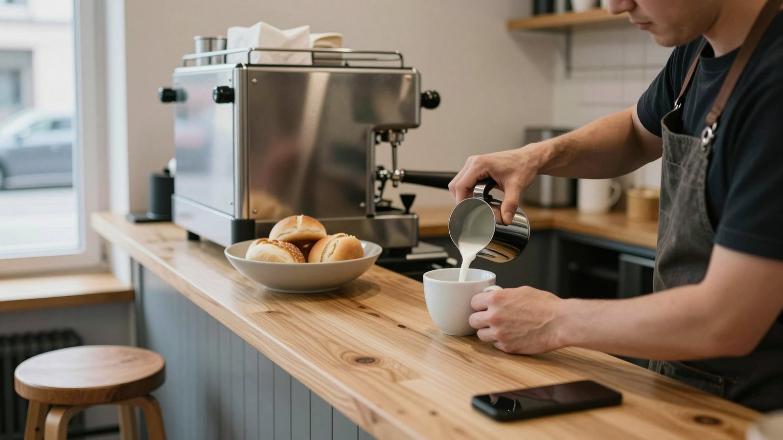
The hungry person with a phone
Your visitor is standing up, outdoors, in a hurry, and often cold. They are not browsing. They have one of four questions and they will leave in seconds if the page does not answer it.
Are you open. What do you serve and roughly what does it cost. Where exactly are you. Can I get a table, or food delivered to me.
Every design decision on a restaurant or cafe site should be measured against those four. A page that looks like a magazine and buries the hours under a video is a page that sends people to the competitor.
Opening hours, menu, address, in that order
Hours first, because a closed kitchen makes every other answer pointless. Put today's hours in words at the top, not only a weekly table further down the page.
Menu second, because that is what decides the walk. Address third, as a real address with a map link that opens the phone's own map app, not a picture of a map.
Everything else, the story of the chef, the interior shots, the awards, sits below those three. It can be excellent. It just cannot come first.
The menu as a page, not a PDF
A PDF menu is the single most common mistake on Finnish restaurant sites. It downloads slowly, it opens in a separate viewer, the text is too small to read on a phone and Google cannot show its dishes in search results.
The menu belongs on the page as text. Dish name, one honest line of description, price. Sections for starters, mains, sweet things and drinks. It loads instantly and it can be read one-handed at a bus stop.
Keep the PDF if you want one for printing, but never make it the only way to read what you serve.
Allergens and the questions your staff answer by phone
Mark the dishes that are gluten free, lactose free and vegan right on the menu line. Finnish customers look for this and a table of eight will choose the restaurant where one person does not have to ring ahead.
Add one sentence about how far you can go. Something like, tell us when you book and we will adapt most dishes, but the kitchen is not free from nuts. Honesty beats a promise you cannot keep on a busy Friday.
Every question your staff answers ten times a week is a line missing from the website.
Lunch, and the list that changes every week
If you serve lunch, the weekly list is the most visited page you will ever have. People check it on Monday morning and again at 11:15 on Thursday. If it still shows last week, they stop checking.
That means the lunch page has to be editable by whoever is in the kitchen office on Sunday evening, in a browser, in two minutes. No developer, no email to an agency. This is exactly what a light content management system is for.
Show the lunch hours next to the list, and say clearly whether the price includes the salad table, bread and coffee. That one line saves a lot of small disappointments.
What the best website for cafe owners does differently
A cafe sells a place to sit, so the best website for cafe owners has to sell the room as much as the coffee. Photos of the corner by the window, the size of the tables, whether there are sockets, whether a pram fits through the door.
Restaurants sell an evening and need booking, menus and a wine list. Cafes sell an hour of somebody's afternoon and need atmosphere, wifi, opening hours and a clear answer about whether you can work there for two hours with one coffee.
Pastry and cake pages earn their place too, because cake orders for a birthday come from exactly one search and they are the most profitable thing a small cafe sells.
Tables, takeaway and delivery
Give each of the three its own button, visible without scrolling. A visitor who wants a table should never have to read the delivery section to find out you also take reservations.
Table booking works best when it is on your own site and takes under a minute. Name, phone, number of people, time, done. Ask for an email address only if you genuinely use it. Our own version of this is booking built into the website.
For groups over a certain size, swap the calendar for an enquiry form. A table of twelve on a Saturday is a conversation, not a click.
Delivery apps and your own ordering
Delivery platforms bring volume and take a commission that you agreed to and probably do not enjoy. They are worth it for discovery and they are bad economics for your regulars.
The fix is not to leave them. The fix is to give your regulars a reason to order directly, a takeaway page on your own site with the same menu, the same prices and a phone number that a human answers.
Put the platform links on your site as well. Hiding them makes nobody order directly, it only makes the customer search again and order from the platform anyway.
Google and the photos people see first
The first photos of your restaurant that most people ever see are not on your website. They are in the Google panel, and a good number of them were taken by customers with a flash.
Upload your own photos there regularly, keep the hours right, and answer reviews in the language they were written in. The panel is free and it outranks your homepage for your own name. Our Google Business Profile guide covers the details.
Special hours matter more for restaurants than for almost any other business. Juhannus, Christmas and the days around vappu are when people check, and when a wrong opening time costs you a full room.
Photographing the food you actually serve
Photograph the real plate, at the window, with the ceiling lights off. Food shot under warm restaurant lighting turns orange, and food shot with a flash looks like evidence.
Three or four excellent photos beat forty mediocre ones. The dish you are known for, the room with people in it, the counter, and something that shows the portion size honestly.
Never use stock images of food you do not serve. Somebody will order the picture and you will have to explain, and that explanation costs more than a photographer would have.
The terrace, the weather and the notice at the top
In Finland the terrace question runs from April to September and it drives traffic every sunny morning. A single line at the top of the page, terrace open today, answers it and gets shared.
Build the site so that line can be switched on and off in seconds. If updating it needs a support ticket, it will never be right.
The same mechanism carries the summer break, the private event on Saturday and the kitchen closing early. Restaurants need one editable notice more than they need almost any other feature.
Private events and the enquiry that pays best
The most valuable page on many restaurant sites is the one about hiring the place for a group. Company Christmas parties, birthdays and funerals are booked weeks ahead and they fill a quiet Tuesday.
Say how many people fit standing and seated, whether you do a set menu, whether the room can be private, and what a realistic deposit looks like. Give a named person and a direct phone number.
Answer those enquiries within the working day. The organiser is contacting three places and the first useful reply usually wins.
Two languages, and the menu in English
Any restaurant near a hotel, a station or a university needs the menu in English. It is the single translation with the clearest return, and it prevents the slow English conversation at the table on a busy service.
Translate the dish names simply and describe the unusual ones. Muikku, leipäjuusto and mämmi need a short line each rather than a clever name.
If your neighbourhood also speaks Swedish, add it for the menu and the hours. The rest of the site can stay in Finnish without anybody minding.
Speed, because food photos are heavy
A restaurant site is mostly photographs, and photographs are what make it slow. On a phone outside on mobile data, a heavy homepage loses people before the first image appears.
Ask whoever builds the site to serve modern image formats at the size they are displayed, to load everything below the first screen only when the visitor scrolls, and to keep the number of outside scripts low. That is ordinary craft and it does not cost extra.
Local visibility depends on it as well, which we go into in local SEO for a business in Helsinki.
What to fix this week
Open your own site on your own phone, standing outside, with the wifi off. Time how long it takes to learn whether you are open, what the food costs and how to book. If it takes more than fifteen seconds, you have found your list.
Move the hours up, turn the PDF into a page, add three honest photos and put a booking button where a thumb can reach it.
Then update the Google panel to match. Those five jobs are worth more than a redesign, and you can finish them before the weekend.